Fossil Central Station Compass
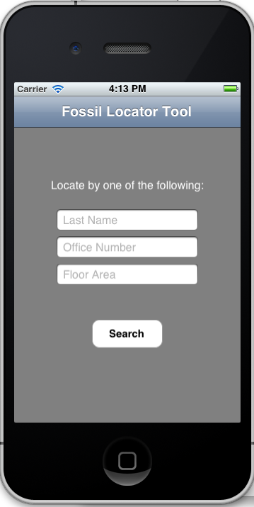
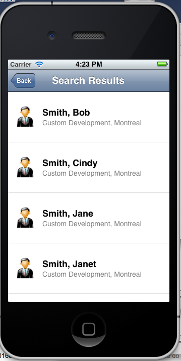
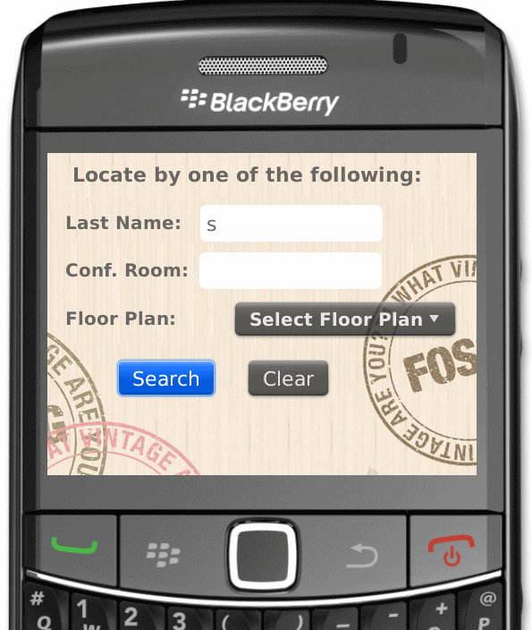
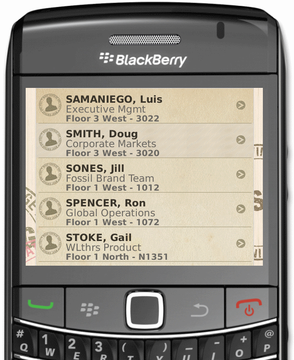
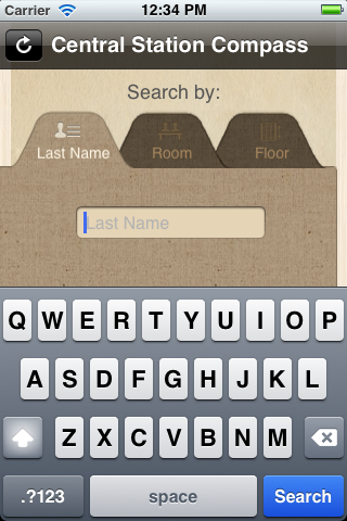
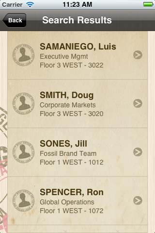
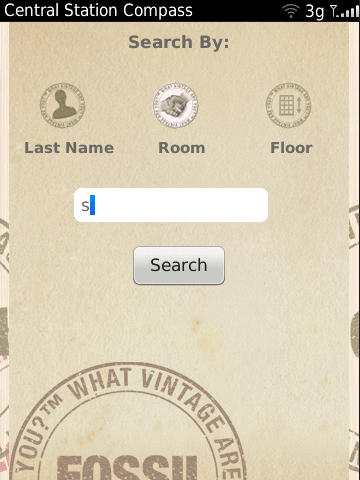
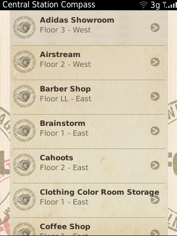
This is a native Blackberry and iPhone person locator tool for a Fossil building. Featuring 3 unique screens (search, results, and map view), Fossil employees and visitors may use this app to locate people or rooms. The only connection required was for the initial download of employee names, conference rooms, and maps displayed on the device.
Role: Designer and Developer
Design: 10 days
UI Development: 10 days
Team Size: 3 people
Project Duration: 2 months
1. First Prototype
For the initial proposal, we were given 5 days to come up with a prototype. Simply put, we had received ideas from our sales team and were asked to implement these within the given time. Although this was not typical to our usual process, we were flexible and did what we could. As a result, I dove directly into coding, fleshing out the provided information into basic screens. The only UX efforts were UI tweaks during this development phase.
2. Color Design
We continued to rush forward and eventually implemented the color design. Our graphics designer provided us with assets as quickly as we developed the app skeleton for the BB and iPhone. As we progressed on development, I saw issues with usability but didn't get the chance to address them. Luckily, we only had three screens and was later given a 3 day deadline extension.
3. UX Intervention
We managed to complete the UI implementation within a week. There were two of us; while I worked on the UI, the other developer integrated the app with the middleware and backend. When we were given the 3 day extension, I worked feverishly to improve usability. I presented the design to our internal UX team for feedback on improvements.
One major change was the separation of the input fields in the search screen of the app. Since the user was only required to enter one of the 3 fields (and not more), it made sense to organize the input fields into tabs. This would help reduce the amount of information on the screen and allow us to be more creative in the design. Since the design was radically different and more complex than what we had before, I immediately discussed the visual requirements with our graphic designer and started coding the adjustments.
We were really happy with the result. It simplified the search process and made the app more visually appealing. Our customer was happy with the change and thought we were progressive with the design.
